Tuesday, 30 June 2015

Purple journal


This is my post. The best colour in the whole world is the one that looks good on you. I recently attended a Kate Crane workshop where we made some brayered backgrounds. I had previously attended a whimsical faces workshop and combined the two to make this journal page. I used acrylic paints and stamps and some gelli prints for the dress.
Debbie x

Monday, 29 June 2015

Box clever


 I bought a very cheap little wooden box for £1 that had three drawers. I wanted it to tone in with the other boxes on my desk so I painted it with warm white acryllic pain and then used a Tim Holtz stencil flourish and Victorian Velvet Tim Holtz distress ink to decorate the sides and top. I added some die cut butterflies with gems for centres and made some roses and leaves - just wanted to keep it simple.
Karen xx

Sunday, 28 June 2015

Paint pot

Here is my paint brush pot that I made out of a cocoa tin. I started with covering it with gesso, added Paper Artsy chalk paint, them added pink tissue paper and finally added one ply of a pretty cocktail napkin, all sealed with PVA glue and a final layer of gesso to tone down the darker purple. I then made a cluster of Prima paper roses on a white leaf, one large lilac rose, one smaller purple one, a white one and a very small green bud with a couple of pearl trims.
Elaine xx

Friday, 26 June 2015

What have you been doing?

Did this weeks scheme appeal to you? What did you do? We'd love to see!

Thursday, 25 June 2015

It's been a bit quiet

As you may have noticed, there's been less posting this week. We have tried to keep up with posting daily where possible but it's not always been possible. We hope you are still enjoying the blog and popping in for posts we hope inspire xxx

Tuesday, 23 June 2015

Hugs and kisses

Here is an anniversary card I made using a Martha Stewart punch anywhere on the page heart punch. I then placed paint chips behind the hearts and used a little glitter glue over the top of them. I then stamped the sentiment using Stampin Up Good Greetings stamp set. I matted the white card on a piece of backing card that I ahead painted using Docrafts blush pearl acrylic paint. Finally I finished with three pearls.
Elaine

Sunday, 21 June 2015

A perfect picture


 I took a white sheet of plain CS and added a scrap of polka dot pink paper. I then added a strip of pastel yellow on the top half. I cut several banners from colour paint chips and added them below the photo that I had matted on pinky coloured paper. I then lightly stamped some butterflies on the background and used a lid to make the larger circles and an ink dauber to make the smaller ones. I used Stampin ups Gorgeous Grunge to add 'splashes'. I then used the Stampin up banner punch to cut the tiny banners on the right of the photo and added some pastel buttons and stuck it onto some pink bakers twine. I also used the paint chips to cut the large butterflies and used various coloured pearls to finish them off.

Friday, 19 June 2015

Fruity flowers


Not just a bowl of fruit has these zesty colours! Head out to your gardens for inspiration!

Thursday, 18 June 2015

Simple beauty

Good morning, here is my take on this weeks colour combination "citrus shades." First I have stamped a flower from Stampers Anonymous Flower Garden with Archival ink. I have then used my distress inks to watercolours the image; I have used Squeezed lemonade, Mustard seed, Spiced marmalade, Peeled paint and Crushed olive. Atter allowing the image to dry I layered on corresponding orange card stock. Direct to the card I have then used The crafters workshop stencil Mini chicken wire reverse to create a background using Spiced marmalade. I have then stamped the sentiment on to cream card, again Stampers Anonymous Perspective, coloured with marmalade and layered onto orange cardstock before adding to the card. To finish I have added a bow with cream string on the flower. CAS! That's all from me today, I hope you enjoy this weeks fresh colour combination. Regards Erika.

Wednesday, 17 June 2015

Win win on the stash


Well one sheet of yellow cardstock, three sheets of patterned paper, a heart punch, a quote, a corner punch and a couple of ready made embellishments and we are done. I created the layout with relative ease, border punching the yellow cardstock, strip of paper over he top, corner punching the photo and cardstock behind, tearing the paper around the edge and adding the journal block and title. Photo taken of a local English Heritage property with a beautiful garden. This left me with a pile of scraps, not enough to warrant another layout but certainly enough to create a few cards and the positives with this that given the paper choice I'd opted for the cards will be appropriate for male as well as females when it comes to birthdays - so a complete win win! How's your scrapping going lovely people? Catch ya later Virginia

Tuesday, 16 June 2015

Zesty cards


Thought I'd share a few zesty cards for the scheme this week! Hope you like!
Laura

Monday, 15 June 2015

It's your day!


My goal in mind was to make a birthday card with a summer feel. Since it has been very rainy where I live, the color scheme was perfect to brighten things up. For the orange and green patterned papers I used Colorbok collection "Beach House." To create the hedgehog image and "it's your day" image I used cuts from the Cricut cartridge Birthday Bash. I cut the hedgehog at 2 1/2 inches and sentiment at 3 inches. I also did some small amount of embossing and cut a border for some extra flair. I thought that you could always add Happy Birthday lettering along the top left side going vertical. I just didn't quite have the right stamp for that. I hope that this card makes your day a little brighter, and thanks for taking a look at my creation! Felicia

Friday, 12 June 2015

Pure and simple

                                          Kamille Fabric
                                          Kamille Wallpaper
                                          Eloise Wallpaper
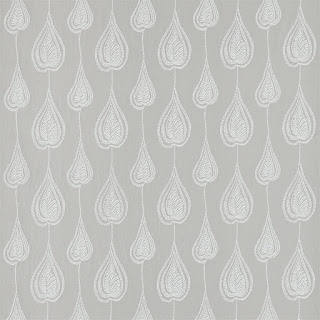
                                         Gigi Wallpaper

Thought I would share some beautiful fabric and wallpapers I am in love with, all in the blue spectrum. These are simple and serene and would look lovely anywhere! Have a look at the Harlequin site to see all the collection here.

Thursday, 11 June 2015

Raindrops

 I don't scrapbook very often but it's lovely to catch up with some old photographs. I tend not to follow the trends but prefer to match the LO to the photos. These are photos of my wee man out playing with what was his new umbrella. We sang the song drip, drip, drip little April showers and that is how this LO came about. I have cut the various raindrops by hand after die cutting the words, then layered on top of mirror card, to look like water. The photos I have enclosed in a cellophane cover and added glitter so it looks like rain. Happy days!
Erika xx

Wednesday, 10 June 2015

Blue brooch


I decided to make a brooch in blues, I used scraps of fabric I have had for ages. I drew around various sized lids to make a pattern.

The fabrics I chose were very thick felt and some curtain fabric from a fabric sample book. I layered and stitched blanket stitch around the edges using embroidery thread, and then added a brooch pin on the back. Have you got any scraps hiding that you could use?
Debbie x


Tuesday, 9 June 2015

Unconditional love

The basis of this layout is from the Teresa Collins collection 'Chic Bebe Boy'. I used this as the circle behind the photos and the reverse side with the black dotty banner, cut the crown from the card stickers and punched some borders with a Martha Stewart punch and added some baby boy buttons of a train and a rattle. I then made a rosette from white card using the Tim Holtz die and edged it in pale blue ink and topped it with a tiny bow. The title was made using Making Memories alphas.
Elaine x

Monday, 8 June 2015

Baby blue


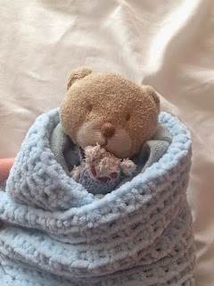
Before Dylan was born, his big brother Luke bought him a comforter- Oofey Bear. Recently, Dylan asked for Oofey to have a bear of her own- Doofey Bear. When I saw the prompt for this week, I couldn't resist. So we made Doofey, with her blue blanket. Then some dungarees for Oofey in a lovely slate blue variegated yarn. Then a blanket for Dylan, in some soft novelty yarn! As his nickname is Dyli Bear, it was only fitting he got a blanket too!
Leanne x

Sunday, 7 June 2015

Beautiful bluebells


Blue is a colour I don't use a great deal and so as soon as I saw this colour palette I knew I wanted to take on the challenge. I used some bluebell photos from one of our favourite spring walk venues - a glorious bluebell woods close to home. I used a panorama photo taken on my phone (I love that phone cameras are so good nowadays and photos taken with them lend to be blown up large) and as I couldn't quite print it 12" wide I cut it into sections. I used lots of different blues for butterflies and swirls to echo the different blues of the flowers. The title was cut from white card on my silhouette and then inked.
Karen x

Saturday, 6 June 2015

Week 13

Little boy blues

A lovely gentle palette for you this week!

Friday, 5 June 2015

Love letters

First I took a papier mâché letter E. I then covered it in torn strips of a dictionary paper stuck with PVA. I then dry brushed white paint over it all and used texture paste with a stencil for the script. I then rubbed gold paste on the edges and raised areas, finally I arranged two clusters of embellishments top and bottom and used some metal charms I had in amongst the clusters. I finished it all off with a sprinkling of pearls dotted around.
Elaine xx

Thursday, 4 June 2015

Modern vintage cards


My offering today is a selection of cards using the vintage colour scheme but they have a modern edge. Slightly more retro with the papers used. The lovely thing with this scheme was being able to vary from bold to subtle. Hope you have fun playing!
Laura xx

Wednesday, 3 June 2015

A bit of everything


A really fun and fabulous colour scheme to work on. I started with the 'Family Selfie' layout by trimming a 12 x 12 paper to A4 width and printing the title and the journalling. It's a quick way to start a layout. I tore the edge once it was printed and made the printed word match the layout in that I chose a dark green type. I also trimmed the photos to get both of them onto the layout. I added some hand cut 'flags' two pieces of star washi tape, so hand punched hearts and a 'love the here and now' The photo captures a family selfie and that split moment a second later, which made us giggle when we saw the photos after. the Charity Ball layout was actually quite timely, I hand cut the flowers from a sheet of paper, overlaying the roses that had parts missing as they were on the edge of the paper. I used a border punched and a white pen to add the journalling. The photo was taken by said 14 year old when we went to a Charity ball. And the last shot is of the three cards I made with the 'offcuts' from the pages I made! Happy Scrapping - Catch Ya Later Virginia

Tuesday, 2 June 2015

Exploding box


I found two sheets of soft cream card and used this as my base and then I used a pale green sheet as the second coloured card. The patterned papers are two sheets from my stash I've had forever! I've had these in my stash for a long time so I have no idea of the maker I'm afraid. However, the soft neutral tones are just what I had in mind for this box.
I then made the cupcake wrapper from some more paper that I stamped with a Stampin' Up polka dot stamp and topped with organza, pinned with pretty pins onto a bubble wrap 'cake'.

Elaine

Monday, 1 June 2015

Digital vintage

I have made another digital page for this colour theme, this time using lots of different elements from various kits and collections all by Dawn Inskip at Scrapbookgraphics. The newspaper backgrounds seemed just perfect for a page about an old building. Adding in the apricot and the green seemed to throw it into greater relief. I love the torn photo masks that Dawn creates especially for an 'old' photo like this.
Karen